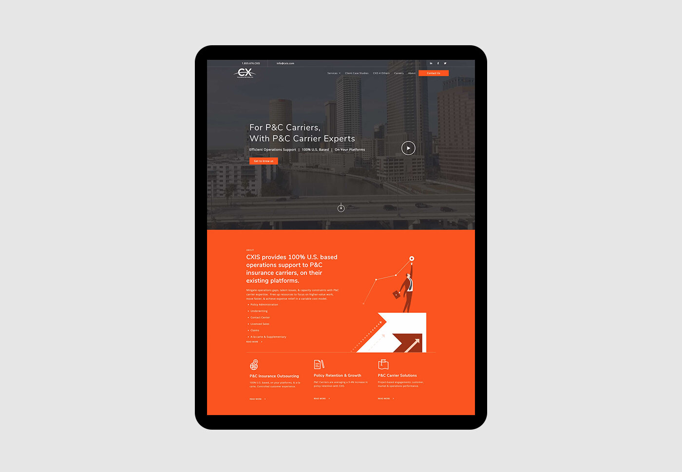
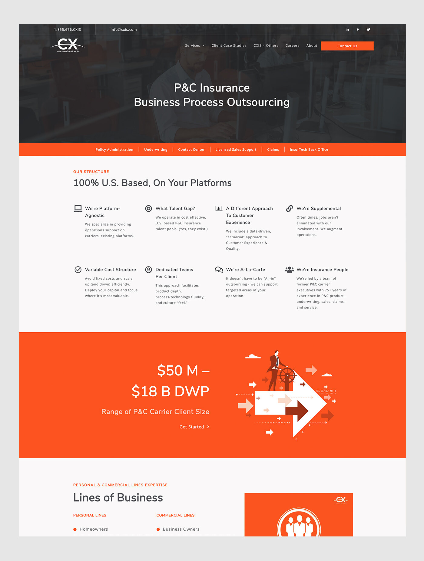
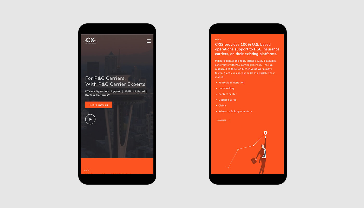
CXIS strives to offer a different approach to insurance—it believes culture is king. They provides 100% U.S. based operations support to P&C insurance carriers, on their existing platforms.
The missing is to take advantage of who they already are. CX’s brand colors are bright orange, and internal communication is casual, breaking the stereotype of the typical insurance company.
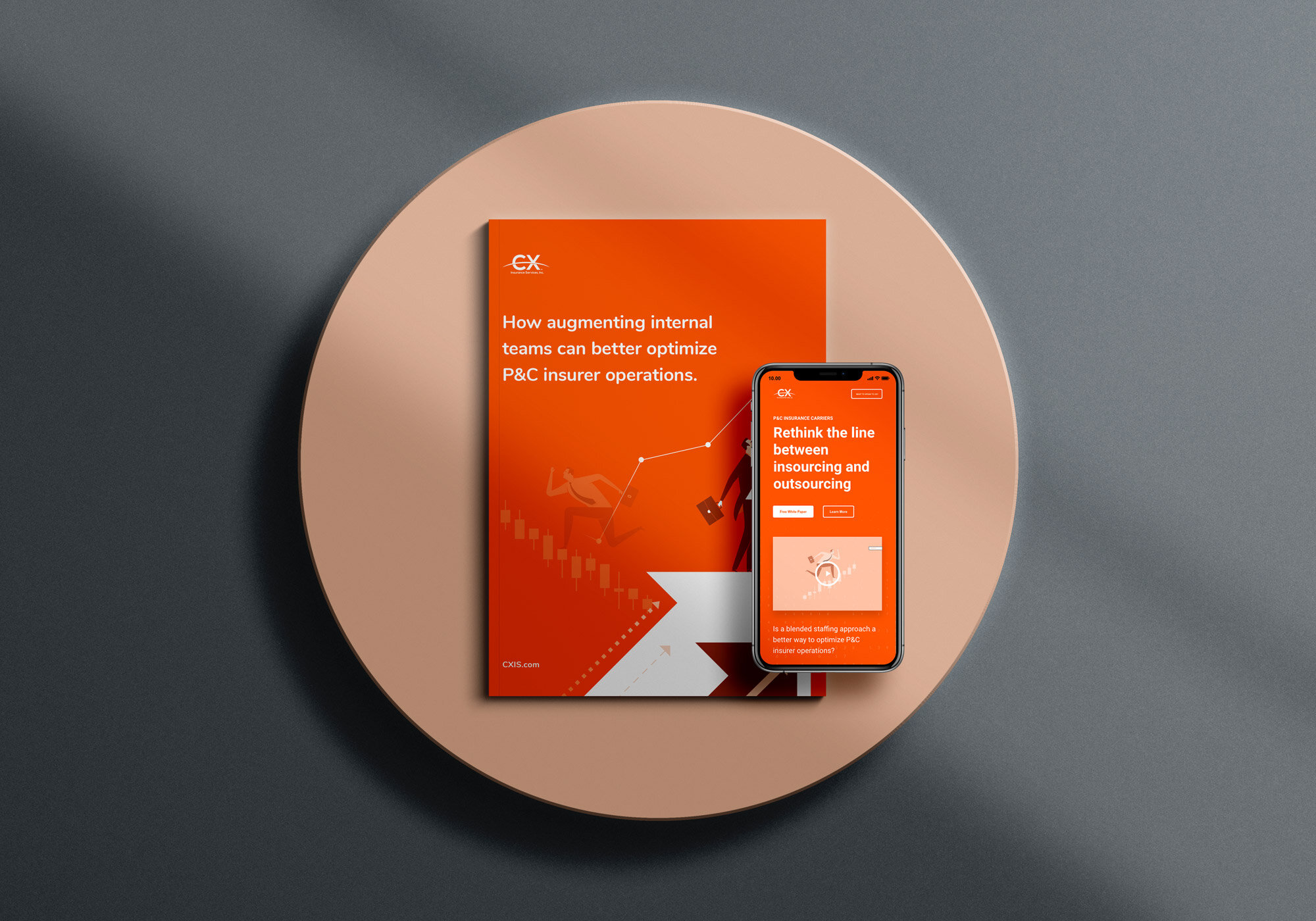
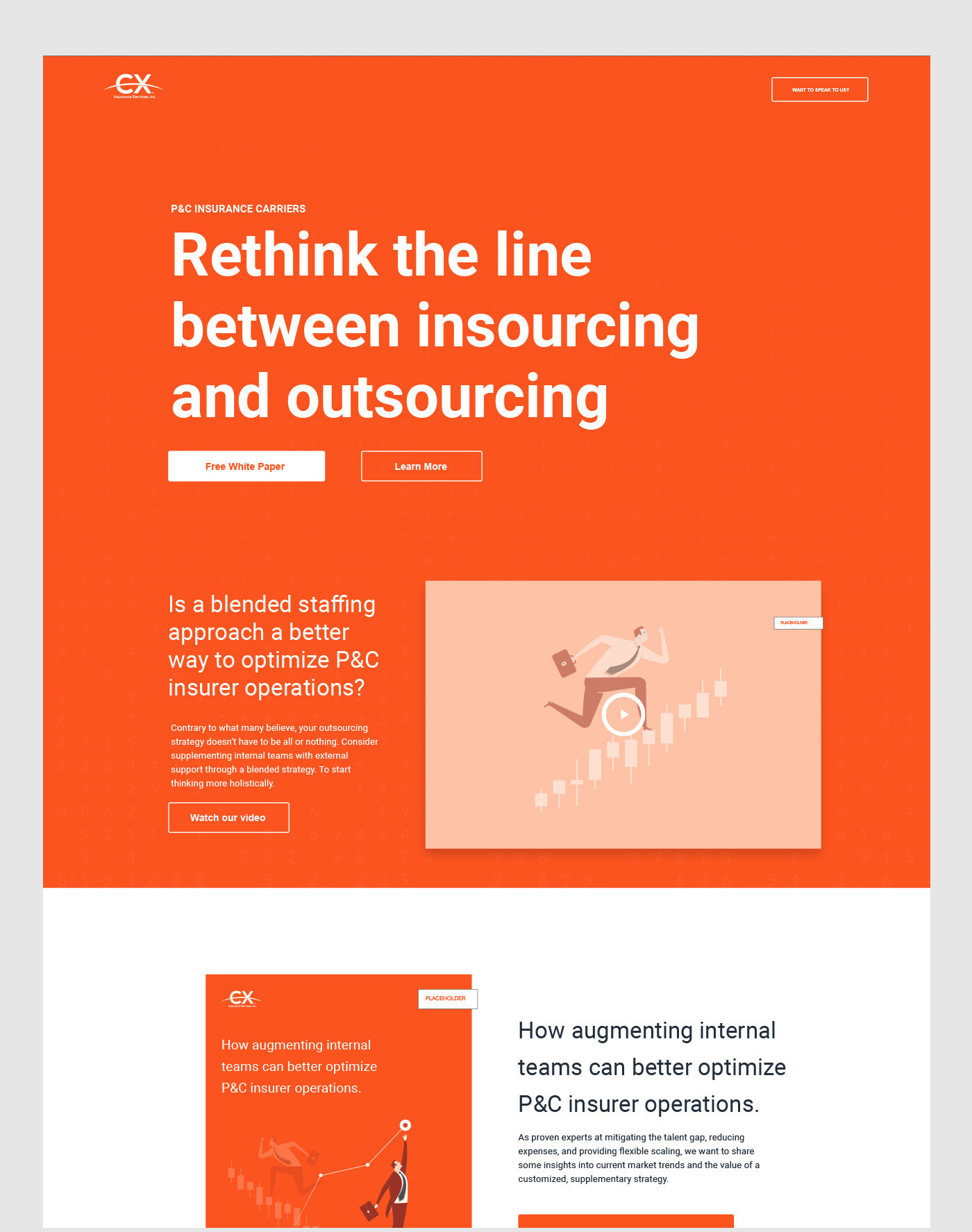
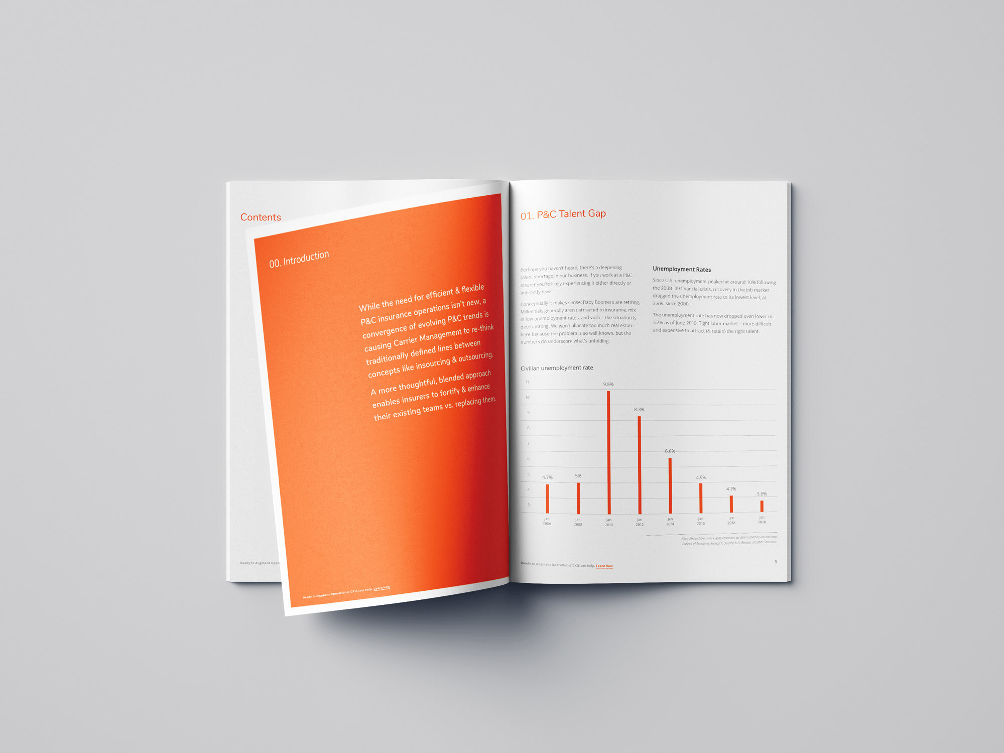
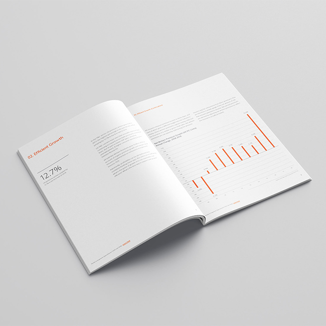
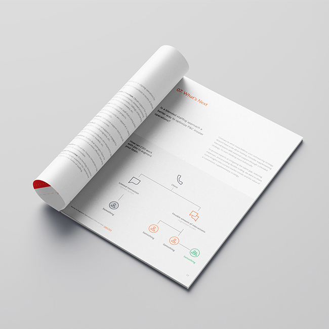
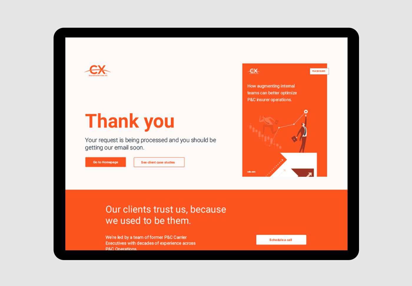
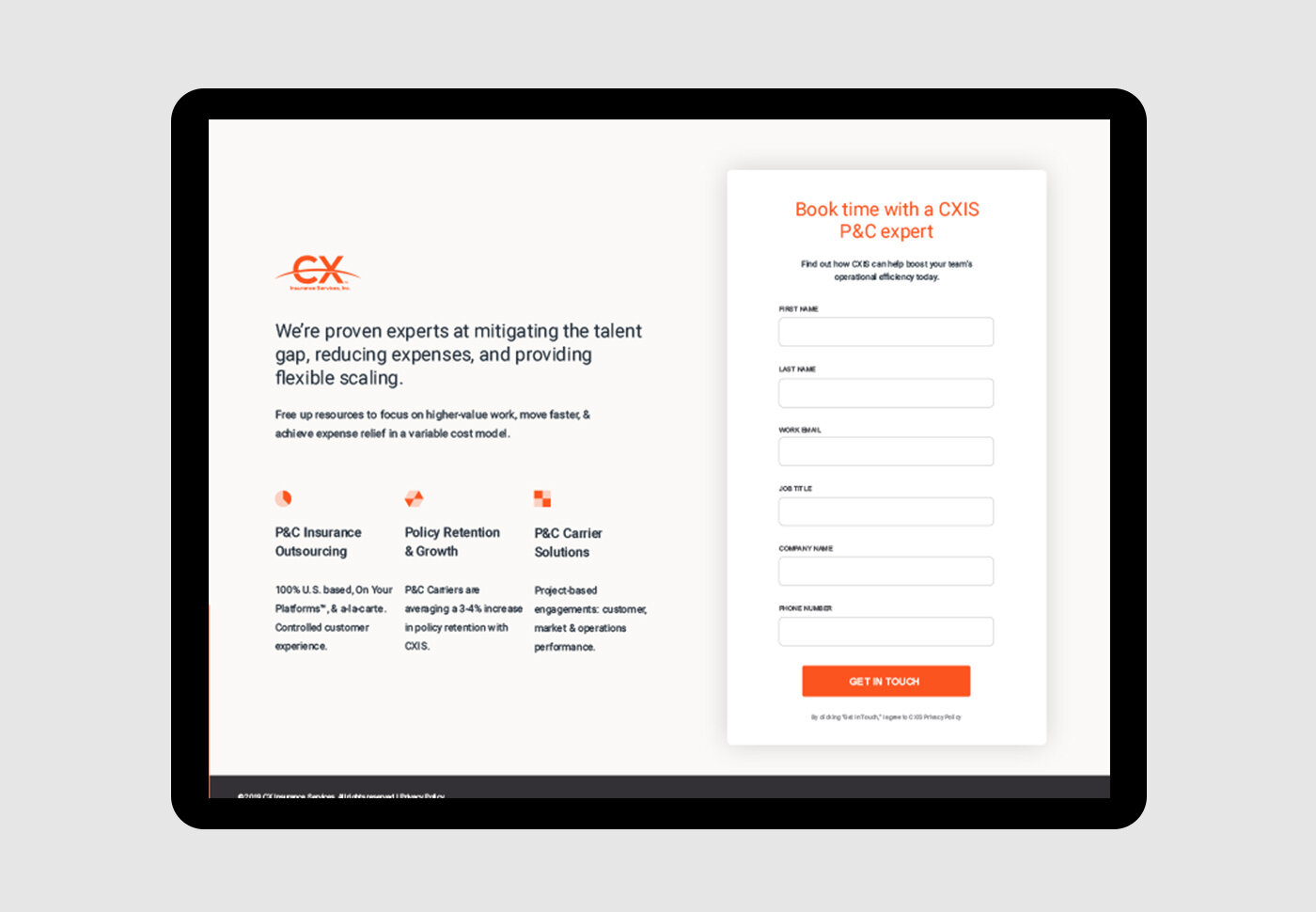
We want to make their marketing materials “stand out” from the crowd of traditional P&C companies. We set out to do the same for its website design.
The main challenge was to move away from heavy stock imagery and to build something a lot more modular and bold. They stand out with their colors, but we needed their entire brand to display their attitude.
